

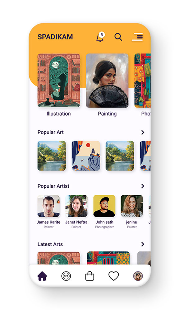
Spadikam App — UI/UX Design
Industry
Marketplace
Client
Freelance Project
Designing a seamless marketplace experience to simplify artwork discovery and purchasing.
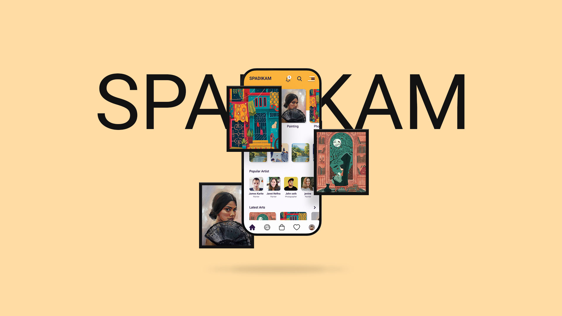
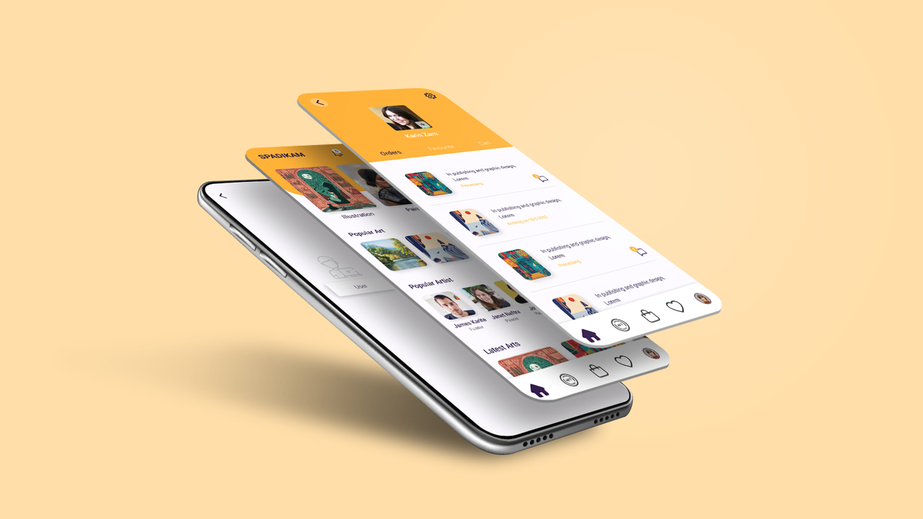
Spadikam is a mobile marketplace platform designed to connect artists with buyers through a seamless digital experience. The goal was to design an intuitive and visually engaging interface that simplifies artwork discovery and purchasing. The key challenge was to balance rich visual presentation with usability, ensuring a smooth and efficient user journey from browsing to checkout.
PROBLEM
Many existing marketplace platforms are cluttered and difficult to navigate, making it challenging for users to discover relevant artwork efficiently.
- Difficulty in discovering relevant artwork
- Overloaded and visually complex interfaces
- Friction in navigation and purchase flow
GOAL
The goal was to design a simple, intuitive, and visually engaging marketplace experience that
- Improves artwork discoverability
- Simplifies navigation
- Creates a smooth purchase journey
- Balances visual richness with usability
MY ROLE
I led the design process end-to-end, from defining user flows to delivering high-fidelity UI, ensuring a seamless and intuitive user experience.
- Defined user flows and interaction patterns
- Created wireframes and UI designs
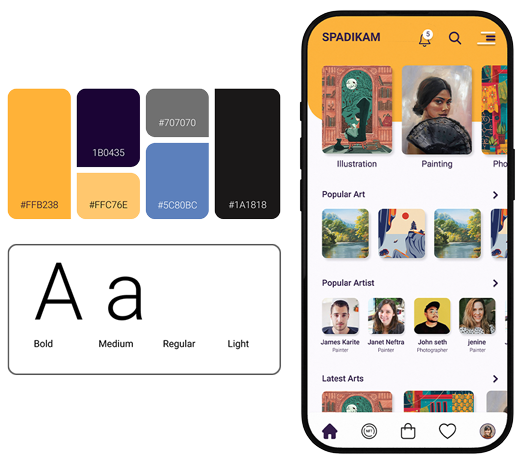
- Developed visual design system (colors & typography)
- Designed high-fidelity screens
USERS
The project followed a structured design approach
Buyers
Individuals looking to discover and purchase unique and authentic artwork with ease.
Artists
Creators seeking a platform to showcase their work and reach potential buyers.
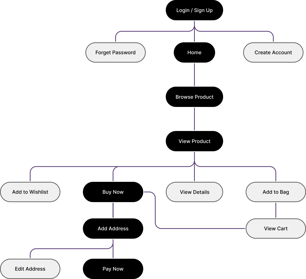
USER JOURNEY
The user journey was designed to be simple and intuitive, guiding users from browsing artwork to completing a purchase with minimal friction.roject followed a structured design approach
Browse → View Artwork → Product Details → Add to Cart → Purchase
MY ROLE
The UI was designed to balance visual richness with clarity and usability
- Minimal layout to reduce cognitive load
- Strong imagery to highlight artwork
- Warm orange tones to reflect creativity and energy
- Clean typography for readability and hierarchy
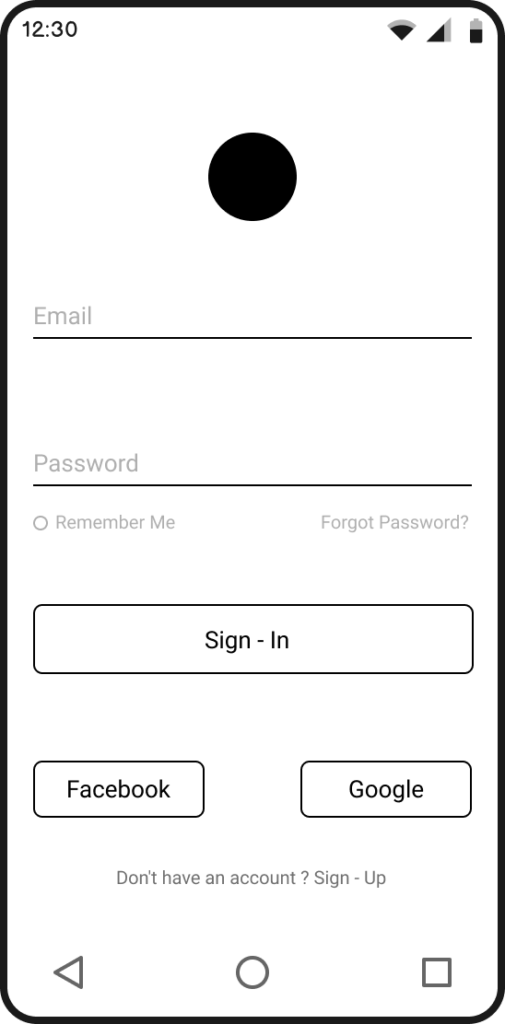
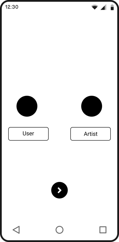
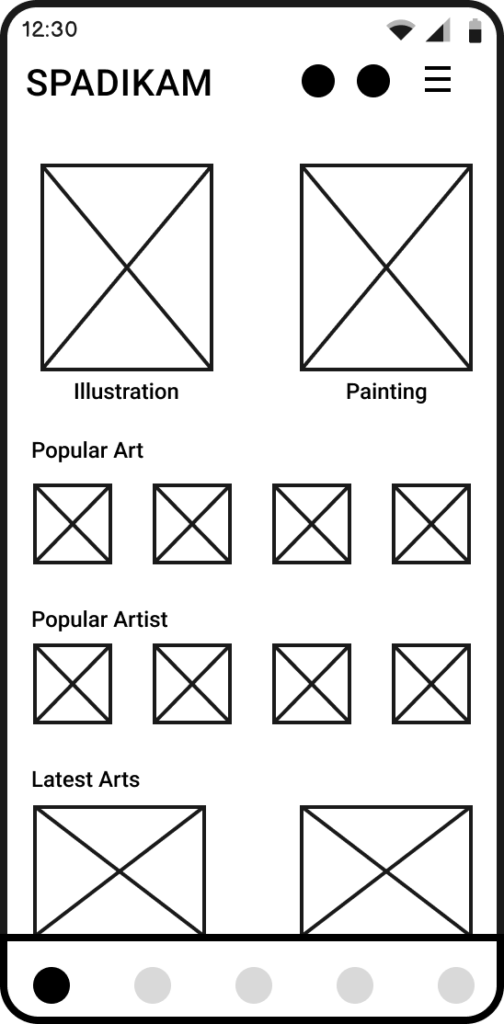
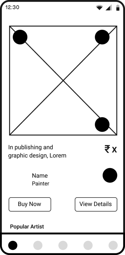
WIREFRAMES
Low-fidelity wireframes were created to define layout structure and validate the user flow before moving into visual design.
KEY SCREENS

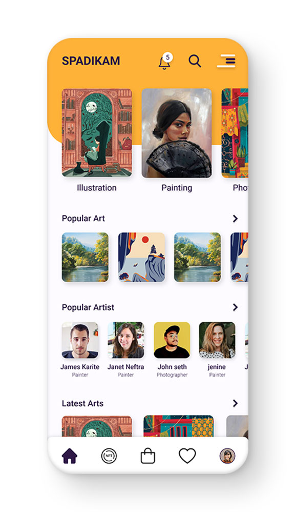
Home Screen
Designed to surface featured artwork and improve discoverability through a clean and visually engaging layout.
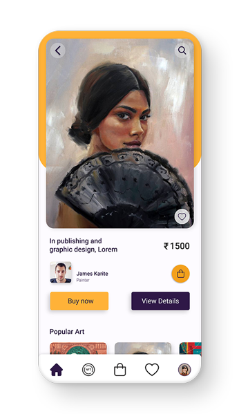
Product Details
Structured to clearly present artwork information, pricing, and actions, reducing decision friction.
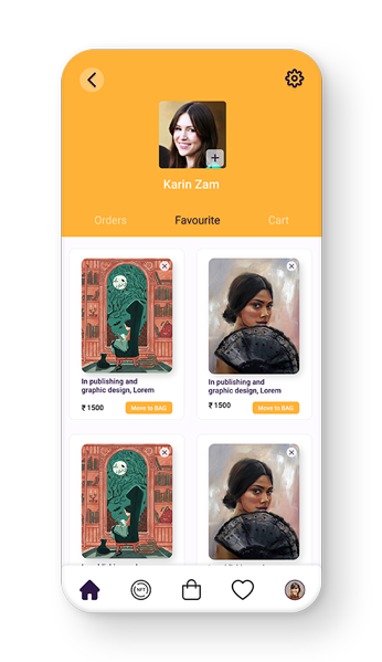
Profile / User Section
Provides users with a centralized space to manage activity, preferences, and interactions.
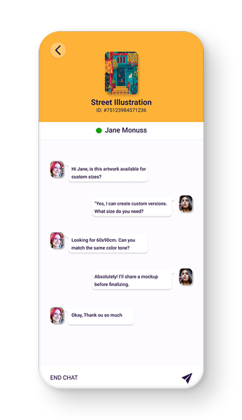
Chat / Conversation
Provides users with a direct way to communicate with artists, discuss artwork details, and build purchase confidence.
Add Your Heading Text Here
The final design addressed key challenges by
Simplified Navigation
Simplifying navigation across the app
Simplified Navigation
Simplifying navigation across the app
Simplified Navigation
Simplifying navigation across the app
Simplified Navigation
Simplifying navigation across the app
FINAL OUTCOME
The final solution delivers a clean and engaging marketplace experience that effectively balances creativity with usability. It enables users to explore, discover, and purchase artwork with greater ease and clarity.
IMPACT
While this was a freelance project, the design focused on improving usability and clarity, which would likely contribute to
- Minimal layout to reduce cognitive load
- Strong imagery to highlight artwork
- Warm orange tones to reflect creativity and energy
- Clean typography for readability and hierarchy
LEARNING
This project reinforced the importance of simplifying complex user journeys and balancing visual expression with usability in product design.